

As each year rolls by we’re always given new things to look forward to. And given the state of the last year we’re all more than ready to see the dawn of a new one! With it comes new prospects, new series of that TV show we’ve been binge-watching, and new design trends.
Now, trends within design are something to look out for. Both for what you need to pay attention to, and what you can ignore. Each year new inspirations drive us, new graphic styles come into play (or existing ones are refreshed), and the visual landscape changes. Trends can be inspired by lots of different things: fashion, music, cultural events, and television. Simply put, design trends can tell us what’s going on in the world.
We include ‘trends you can ignore’ for one main reason: trends come and go. Your business and your brand isn’t a trend. It’s important to apply design in a way that won’t go out of style.
It should go without saying that it’s very difficult to accurately predict what will happen in the year, especially this year(!) so take what we say with a pinch of salt!
Trends you need
Hero Type
Type has always been a big thing, but in 2021 it’s getting bigger.
Expect to see instances of type being used not just as part of a design, but the key feature of it; as the ‘Hero’. Whether it’s chunky, condensed sans-serifs or curvy, or display serifs, type is taking the center stage.
It’s not all being used in the same way either. We see examples of type taking the spotlight and being used in a way that breaks all the rules: chaotic and unruly. We also see examples of heavy, bold type used for its sheer power.
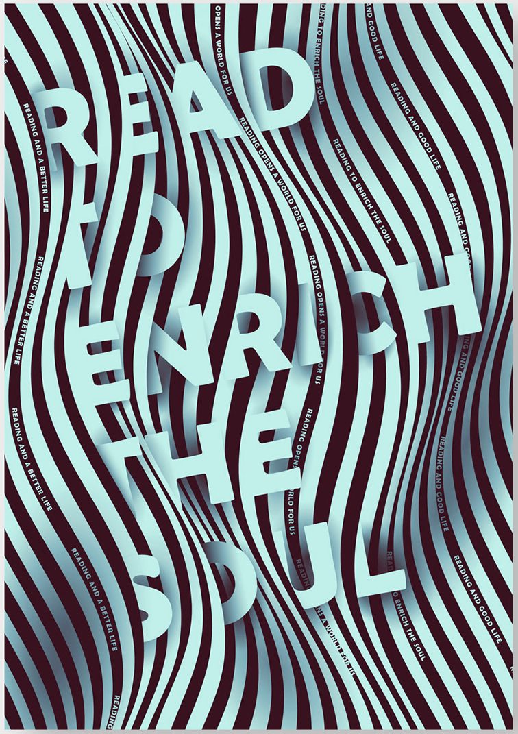

https://www.behance.net/gallery/101416561/World-Book-Day-Typographic-posters
https://www.behance.net/gallery/84984877/Beats-Per-Moment
3D
An upcoming trend that’s recent revival has been strong-armed by the ever-increasing advances in technology. With easy-to-use 3D software like Blender and Adobe Dimension entering designers’ hands, and advancements in deploying these lush graphics on websites and video has helped to enable this trend to come to fruition.
It’s interesting to consider that eons ago at the dawn of the ‘dot com’, there was an abundance of designs using ‘3D’ elements. ‘3D’ in quotes here because, really, they were simple 2D sprites attempting to fabricate an additional dimension. But the key here is they were used for their sense of futurism – they made websites look ‘cool’. Don’t lie, we all had some sort of this thing on our MySpace pages!
All the way into the future in 2021, 3D use hasn’t changed much. Sleek, smooth, 3D: animations; illustrations; characters, and even typography have found their way back into our visual ecosphere and are being used to ‘wow’.
These 3D designs can take on a lot of different forms, be it cartoony, glam and gold, flat, simple, and refined. This is great because it means you don’t need to try to pigeonhole your brand’s style to take advantage of this trend – chances are, there’s a way to make yours work in the third dimension.
Authenticity
After a tumultuous 2020, we’re all a little on edge. We were all inundated with brands telling us to ‘stick together’ and ‘be positive’ through what was largely a very difficult time for us all in a global pandemic. The last thing we want now is to be forced to endure any more patronising and empty marketing. Being sincere, authentic, and honest is now more meaningful than ever.
This authenticity can take form in many ways. We see examples of brand messaging becoming more down-to-earth, especially on social platforms like Facebook and Instagram. We see examples of graphics and photography being used to simply reflect a given subject or content rather than any artistic ploy.
Similarly to how it doesn’t feel so good when brands forget Pride is a thing as soon as their marketing manager decides the campaign is over for this year. Where this idea of authenticity really begins to have a lot of impact is where the entire brand’s ethos and strategy are set up with this ‘be authentic’ in mind. A cracking example of this is:
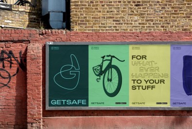
Honest rebrand for insurance company
https://www.creativeboom.com/inspiration/designstudios-imperfect-rebrand-for-getsafe/
Positivity
In the same general vibe as authenticity, after 2020 we’re all craving some positivity. Remembering what we said about our last trend though, we need to be authentic so as to not appear insincere.
Having a product that’s all about sending a positive message – or even better, having a product that actually enables good times (Music – shows – television – good food – healthy living…)
Or you can focus on sending a positive message. On social media. On your website. As part of your brand’s core ethos!
Or you can align your brand with do-gooding! Examples below
Innocent Charity – https://www.innocentfoundation.org/about-us/about-the-foundation/
Ben and Jerry’s Earth Day – https://www.youtube.com/watch?v=ZsdekabK8Yw
Going Dark
A trend that’s been growing in popularity over the last few years. By ‘going dark’ we mean a colour palette that’s abundantly made up of dark colours. Black blacks, dark greys, and white.
This trend has come to the limelight in part due to ‘dark mode’ becoming popular recently. It makes sense why many users choose to use this over the ‘light’ versions of let’s say, a mobile operating system.
The saturation of white and white and white takes its tolls on the eyes, and there are arguments to be made that things like dark mode are helping to alleviate this. Especially when we consider how much of our browsing takes place ‘after hours’. Colour modes that reduce blue light have been proven to affect sleep less than full-colour. It’s also been brought up that it uses less battery power on mobile devices.
Aside from those fancy scientific reasons, some brands are taking full advantage of this idea of ‘going dark’ for its visual impact. Spotify is an OG of this idea. British Museum uses it nicely, it especially works for them because it makes their images pop.
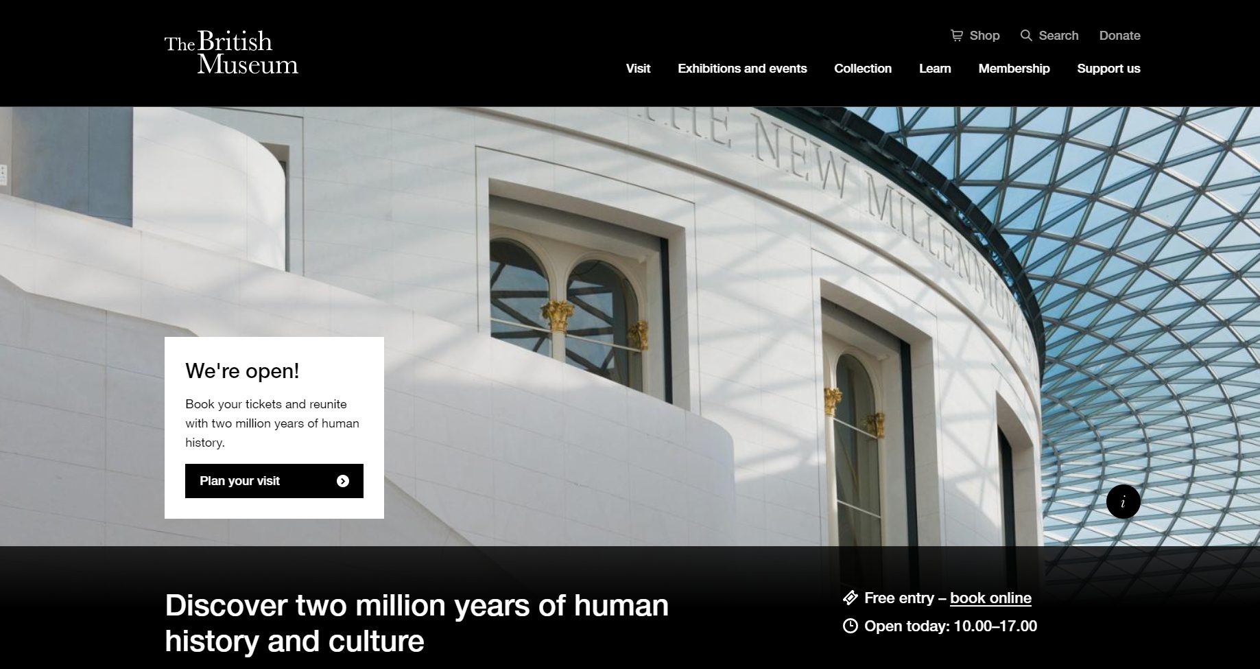

First: British Museum
Second: Spotify
Trends you can ignore
Now we’ve covered the trends you do need to pay attention to, let’s move on to the trends you can ignore!
Illustration Styles
Anyone who tells you a particular style of illustration is ‘trending’ in 2021 should be listened to dubiously, with a raised eyebrow. Trends come in and out of style, and if anything comes in and out of style faster than anything else it’s particular styles of illustration.
‘Cartoon’ style illustrations, ‘flat’ style, ‘futuristic’ style, the list goes on. Each year there seems to be a new style that’s ‘in’. This idea needs to go. In reality, any style of illustration can work for your company as long as it fits your brand. Any style of illustration can be made to appear modern, so forget about trying to find that latest illustration style to be relevant.
Monochrome and Duotone
I’ll admit it does confuse me when I look through other articles which talk about the upcoming design trends. Most do a great job of explaining the visual and cultural antecedents of trends we’re currently seeing take stage. Some, on the other hand, seem to think that simple photo-treating techniques are ‘trends’ on their own. It’s similar to saying that because you saw a tyre pump, that bicycling must be taking over.
In particular, I’ve seen people talk about monochrome and duotone as if these two ingredients are a trend in themself. Monochrome is simply a one-colour treatment, whereas duotone is, unsurprisingly, a two-colour treatment. On their own, these techniques aren’t enough to justify a globally emerging trend. And that’s not just because the techniques have been around for ages. It’s like having a vanilla pod and some frosting, and believing you’ve made a cake.
One can easily imagine how we could take some of these principles of image treatment and apply them to our ‘Going Dark’ trend, for example.
What I’m trying to say is that on their own these aren’t significant enough to justify defining a trend. However, applied as an overarching system with more design elements considered, they are useful treatments in creating a more encompassing style.
Geometric Shapes
Ah, geometric shapes. Every year I read that this year they’re the big thing. Did you know? Circles are making a comeback. Amazing! I didn’t see any in 2020. None at all. I thought we may have run out.
The thing is, defining entire artistic movements by their use of geometric shapes is a thing. The Bauhaus is a perfect example of the use of geometric shapes to entirely define a new way of design thinking (and this has its antecedents in Cubism and Futurism… so it’s nothing new). De Stijl is another artistic movement that utilises geometric shapes.
There have been many companies that have made successful use of geometric shapes to enhance their brands. In fact, much of the trends we’ve seen in design in the past decade (and not just in the past few years) deal with the subject of minimalism – or if not exactly minimalism – then minifying at the least. The reduction of complexity and the idea of visually, things moving towards a more refined and simple aesthetic has had a large impact.
Unfortunately, it doesn’t mean I can sign off on the idea that geometric shapes are, in themself, a trend.
Contact Us – Surrey Web Design
Thunderbolt Digital is an award-winning digital marketing agency in Surrey with in-house web designers. We’re only a phone call away from improving your web design or online marketing campaign! Get in touch today by calling 01252 959795 or email howdy@wearethunderbolt.com – we can’t wait to hear from you.