Posted On:
Three Things Startups Can’t Afford to Forget When Designing Logos
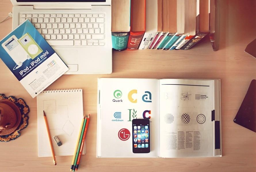
Thunderbolt Digital’s expert design team are the number one place to come for logo design Surrey, and after many years of practical experience, have a fair amount to say on the matter, including what fundamentals you simply can’t ignore. People are highly visual, and consumers prioritise aesthetics when making purchasing decisions, which is why it’s absolutely vital to have a good logo for your company: it should be attractive, eye-catching, memorable and relevant to your brand. We know that SMEs and startups can often struggle to actually conceptualise something that fits this description, so we thought we’d share some pointers to help start off any beginners in the right direction! Some key components to remember when designing a logo are…
Colour
Certain colour combinations can make or break a logo, and it’s important to choose wisely when it comes to colours to properly represent your brand. Think about famous businesses like McDonalds or Pepsi – simply the colours used in their logos (red and yellow, and red white and blue respectively) can often bring the brand to the forefront of the mind even if the associated shapes and company name are missing.
When you’ve come up with a colour scheme you think is appealing and relevant, don’t be afraid to tweak it so that it works harmoniously with other colours. After all, your logo needs to complement the rest of your branding, including your website, packaging, and more.
Shape
Of course, whilst colour should be a priority, that doesn’t mean that shape should be ignored! Curves and ‘softer’ shapes used in logos can feel more relationship and community focus in nature, whereas squares are often perceived as solid, strong and professional. So, if you’re stuck on what sort of symbol to use for your logo, then looking up shape psychology might help point you in the right direction!
Typeface
Another important factor to consider for your logo is typeface – your choices in font, kerning (letter spacing), capitalisation, italics and more can add presence to your brand as well as emphasise certain aspects of your brand name that you wish to draw attention to. Line weight, and choosing between a serif and sans serif font can also drastically change the look of your company name and logo; try and test out a number of variations to see which looks best, and, if possible, get feedback on your choices from focus groups.